In today's digital age, having a strong online presence is essential for businesses to thrive. One crucial aspect of web design that should not be overlooked is responsiveness. Responsive web design ensures that your website adapts and functions seamlessly across different devices and screen sizes.
Enhanced User Experience
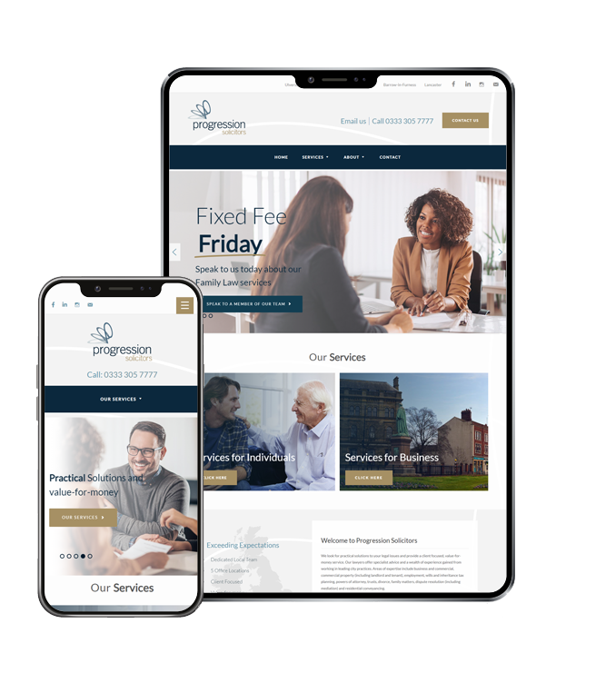
Responsive web design prioritises user experience by providing optimal viewing and interaction across various platforms. With the increasing use of mobile devices, it is crucial to have a website that is easily accessible and navigable on smartphones and tablets. A responsive design allows your visitors to have a seamless browsing experience, regardless of the device they are using. By providing a user-friendly interface, you can keep visitors engaged, reduce bounce rates, and increase conversions.

Improved Search Engine Optimization (SEO)
Search engines favour websites with responsive designs. Google recommends responsive web design as it improves user experience and simplifies website maintenance. With a responsive website, you can consolidate your online presence, as there is no need for separate mobile and desktop versions of your site. This consolidation leads to better SEO performance, as search engines can efficiently crawl and index your website, resulting in higher search engine rankings.
Cost and Time Efficiency
Developing and maintaining separate websites for different devices can be costly and time-consuming. With responsive web design, you only need to create and update one website that caters to all platforms. This saves resources and streamlines your web development process. Additionally, a responsive website future-proofs your business, as new devices and screen sizes emerge, your site will automatically adapt without requiring significant modifications or additional expenses.

Increased Reach and Accessibility
By embracing responsive design, you ensure that your website is accessible to a wider audience. With the growing number of mobile internet users, having a mobile-friendly website is essential to reach potential customers on the go. A responsive website allows you to engage with users across various devices, enabling you to expand your reach and maximize your online visibility.

Furness Media: Your Web Design Partner
At Furness Media, we understand the importance of responsive web design in today's digital landscape. Our experienced web design team specializes in creating visually appealing and user-friendly websites that are fully responsive. We tailor our designs to meet your specific requirements and ensure that your website functions seamlessly on any device. By partnering with Furness Media, you can enhance your online presence and provide an exceptional user experience to your visitors.
Responsive web design is not just a trend but a necessity in today's mobile-centric world. It ensures that your website delivers a consistent and optimized experience across all devices, ultimately enhancing user engagement and driving business growth. Furness Media can help you stay ahead of the competition. Contact us today to create a website that captivates your audience and delivers outstanding results.
Call: 01229 520 250
Email: sales@furness.media
Address: Furness Media, 84 Dalton Road
Barrow-in-Furness LA14 1JH
Company Number 11023066